Meme Generator
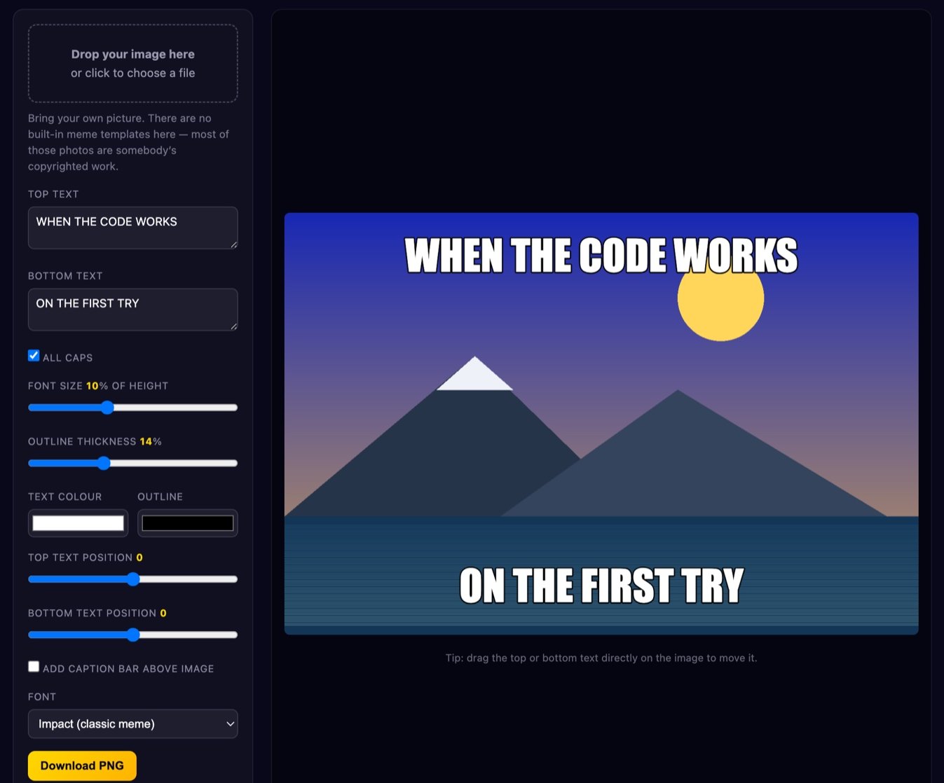
Put classic top-and-bottom meme text on your own picture. White letters, thick black outline, automatic word wrap, live preview, and you can drag the captions wherever you want them. Export a PNG or JPEG at the original resolution — everything happens in your browser, nothing is uploaded.
or click to choose a file
Bring your own picture. There are no built-in meme templates here — most of those photos are somebody’s copyrighted work.
How to make a meme
- Add your image. Drag a photo onto the box or click it to pick a file. A screenshot, a photo of your dog, a frame from your own video — anything you have the right to use.
- Type the top line. This is the setup. Keep it to a handful of words; it wraps automatically and shrinks itself if it would take over the picture.
- Type the bottom line. This is the punchline. It should be readable in about a second.
- Adjust the look. Font size is a percentage of the image height, so a small phone photo and a huge camera file give the same proportions. Outline thickness, text colour and outline colour are all adjustable; white on black is the default because it works on almost every photo.
- Move the text. Use the position sliders, or just drag either caption around the canvas with your mouse or finger.
- Optionally add a caption bar. Turn on “Add caption bar” to place a solid white strip above the picture with black text in it — the other extremely common meme layout, and much easier to read for longer sentences.
- Download. PNG keeps the text edges perfectly sharp. JPEG makes a smaller file. Both export at the full original resolution of your image, not the size of the on-screen preview.
Why memes use that specific look
The classic meme face is Impact: a very heavy, very condensed sans-serif released in 1965 and shipped with Windows from the mid-90s onward. It became the meme font almost by accident — it was simply the boldest thing on the default font list of the image editors people had at the time — but it survived because it is genuinely good at the job. Condensed letters mean you fit more characters per line before wrapping. Heavy strokes mean the letters do not disappear when the image is scaled down to a thumbnail in a feed.
The black outline solves a harder problem. A caption sits on top of a photo you do not control: it might be a bright sky, a dark room, or both within the same line of text. Plain white text vanishes over snow; plain black text vanishes over shadow. Drawing a thick dark stroke around white letters guarantees contrast in both directions, because there is now always a dark edge next to a light fill no matter what is underneath.
Technically it is drawn in two passes. The canvas first strokes the text with a wide line width in the outline colour, then fills the same letterforms in white on top. Because a stroke is centred on the letter's outline, half of it falls inside the glyph, so a very thick stroke starts eating into thin parts of the letters — that is why the thickness control here has a sensible ceiling. The stroke also uses rounded line joins, which stops sharp spikes shooting out of pointed corners like the apex of a capital A or the vertex of a W.
Writing a caption that actually lands
Most memes fail on writing, not on design. A few rules that consistently help:
- Short beats clever. People scroll. If your caption needs a second read, it has already lost. Aim for under ten words per line.
- Setup on top, payoff on the bottom. The two-block format is a joke structure, not decoration. The top line establishes a situation the reader recognises; the bottom line reveals the twist. Putting the funny part on top wastes the format.
- Put the twist at the very end. The last word should be the surprising one. “and five new bugs appear immediately” is weaker than “and five new ones appear” — the ending word carries the hit.
- Read it aloud. If you stumble, so will the reader. Awkward phrasing is much easier to hear than to see.
- Cut every word that isn't working. Adverbs, “literally”, “just”, “really”, and most articles can usually go. Delete a word; if the meaning survives, leave it deleted.
- Be specific. “When the code works” is nothing. “When it works and you don't know why” is a shared experience.
- Match the picture. The image should already imply the emotion. If you have to explain the feeling in the text, pick a different picture.
Sizes for sharing
Feed posts are safest as a square, 1080×1080 pixels. That crops predictably everywhere and is what most platforms actually store. Vertical stories and short-video covers want 1080×1920. If a meme is going into a story, keep the text well away from the top and bottom fifth of the frame, because interface elements such as the profile chip and the reply bar sit there and will cover it.
A note on quality: every time an image is uploaded, the platform re-encodes it as JPEG. JPEG is lossy, and it is especially bad at exactly what memes are made of — hard black-and-white edges. Each re-upload adds another layer of blocky artefacts around the letters, which is why old memes look like they have been photocopied a hundred times. That effect is called generation loss. Avoid it by always saving and posting your original export rather than re-sharing a screenshot of a screenshot, and by exporting PNG when the platform accepts it.
Using other people's images
Being brief and honest about this: photographs and film stills are usually copyrighted, and the fact that an image is widely used as a meme template does not change that. In most everyday personal posting nobody is going to come after you, and many jurisdictions have parody or fair-use style exceptions — but those exceptions are narrower than people assume, and they get much narrower the moment money is involved. If your meme is going on a company account, into an ad, on merchandise or anywhere commercial, use a photo you took yourself, properly licensed stock, or genuinely public-domain material. That is why this tool deliberately ships no built-in template library. None of this is legal advice.
Is my image uploaded?
No. Your file is read locally with the browser's File API, drawn onto an HTML5 Canvas element, and exported straight back to your device. There is no server call at any point — the tool would keep working with your network disconnected. Nothing is stored, nothing is logged, nothing leaves your browser. Details are in our Privacy Policy.
FAQ
Why does my text look different on another computer?
Because Impact is a system font, not one we load from a server. It is installed by default on Windows and macOS but is often missing on Linux and on some Android devices. When it is absent the tool falls back to the next-heaviest condensed face available, then to Arial Black, then to the generic bold sans-serif. The exported image bakes the text in as pixels, so whatever you see in the preview is exactly what everyone else will see in the file — the difference only appears if you re-open the editor on a different machine.
Can I use more than two lines of text?
Yes. Both boxes wrap automatically at the image width, and you can press Enter to force a line break where you want one. If a block gets tall enough to cover too much of the picture, the font size steps down on its own until it fits.
How do I move the text off the default position?
Drag it. Press on the top or bottom caption on the canvas and move it; it works with a mouse, a trackpad and touch. The two position sliders do the same thing vertically if you want finer control, and “Reset positions” puts everything back.
PNG or JPEG?
PNG for anything with text, which means basically every meme — it is lossless, so the outlines stay razor sharp. Choose JPEG only when file size genuinely matters, for example an email attachment or a very large photo. The download is always at the full pixel dimensions of the image you loaded.
Can I put text in the middle of the image?
Yes — drag either block to the centre, or use the position sliders. A single centred line over a plain background is a common modern format, and it often reads better than the two-block layout when the joke is one sentence.
Does the caption bar work with long text?
Yes. The white bar grows in height to fit however many lines the caption wraps to, and the image below it is untouched, so the picture is never covered. That is the main advantage of this layout for anything longer than a few words.
More tools
Need to reframe the picture first? Use the image cropper to get a clean square or 9:16 frame, or the image resizer to bring a huge camera file down to a sensible posting size before you caption it. All of them, and the rest of our free browser utilities, are on the tools page.