Image to ASCII Art Generator
Drop in a photo and turn it into ASCII text art, right here in your browser. Tweak the width, characters, contrast and colour until it looks right, then copy it or download it as a TXT or PNG. Nothing is uploaded to a server — the whole thing runs on your device.
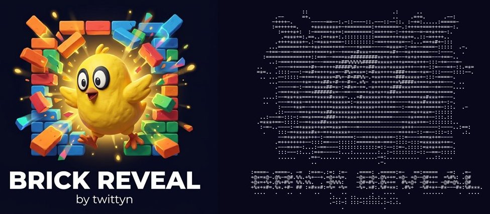
or click to choose a file
How to turn an image into ASCII art
- Add an image. Drag a photo onto the drop box or click it to pick a file. It is read straight from your device and converted as soon as it loads.
- Set the width. The slider (30 to 220) sets how many characters wide each line is. The number of lines follows your image’s own proportions, so the shape stays right at any width. Start at 100.
- Fix the tones. Contrast (0.50 to 2.50) pushes light and dark apart around the mid-grey point; brightness (−100 to +100) shifts everything up or down. Most photos need a nudge up on contrast before the subject separates from the background.
- Pick a character set. Five ramps are built in: Standard (10 levels), Detailed (15), Blocks (5), Fine (70) and Two-tone. Switch between them with an image loaded to see which suits the picture.
- Try Invert and Colour. The output is built for light text on a dark background; tick Invert if you are pasting somewhere white. Colour leaves the character choice alone and tints each one with its original pixel’s RGB.
- Copy or download. “Copy text” and “Download .txt” both give you the plain characters. “Download .png” renders the art at 8px monospace on the dark page background and saves it as a picture, keeping the colours if Colour is on.
How ASCII art conversion actually works
The trick is simpler than it looks. Your image is not analysed for edges or shapes. It is shrunk down to a tiny grid — ask for 100 characters wide and the browser redraws your photo into a canvas exactly 100 pixels across, its own scaling averaging everything that fell inside each cell into a single pixel. Each pixel of that miniature becomes one character.
For every cell we read the red, green and blue values and collapse them into one brightness figure using the standard Rec. 601 luma weighting: 0.299 × red + 0.587 × green + 0.114 × blue. Those weights are not arbitrary. Human eyes are far more sensitive to green than to red and least sensitive to blue, so green carries nearly 59% of perceived brightness while blue carries barely 11%. Average the three channels equally instead and blue skies come out too light while red objects come out too dark.
That brightness runs through your settings — contrast multiplies the distance from mid-grey (128), brightness adds a flat offset, and the result is clamped back into 0–255 so nothing wraps around. The value is then scaled to a position between 0 and 1 and used to index into the character ramp: a string of characters ordered by how much ink they put on the screen. Here the ramps run from a space at one end to a solid @ at the other, and because the output is built for pale text on a dark background, the brightest cells get the densest characters. Invert flips that position so the ramp reads the other way. Colour changes nothing about which character is picked; it tints each one with its cell’s original RGB, so the shapes still carry the brightness and the colour rides on top.
Why the character set matters
The ramp influences the look more than width or contrast does. A short ramp offers only a handful of tones, so the picture is forced into hard steps. Two-tone (a space and a #) is the extreme case: a stark, poster-like silhouette that either works brilliantly or falls apart completely. Blocks (5 levels of round, filled characters) gives that chunky old-terminal feel and stays readable when scaled small. Standard (10 levels, the classic .:-=+*#%@) is the right default for almost everything. Detailed (15) and especially Fine (70) give smoother gradients, but the extra levels are wasted at low widths — a 40-character-wide face has so few cells that fine tonal steps just read as noise. Long ramps repay you only when you give them width too.
There is a shape dimension as well. Ramps built from punctuation and thin strokes (. , : ; i 1 t f) look sketchy and hand-drawn, like a pencil study. Ramps built from filled forms (o O 0 @ # %) look solid and printed. True Unicode block characters (█ ▓ ▒ ░) go further still, producing something closer to a low-resolution bitmap than to text art — though they are no longer strictly ASCII, and some older terminals will not render them.
Choosing a width
Characters in a monospace font are roughly twice as tall as they are wide, so mapping one character to one square pixel would produce a result twice as tall as the original. This tool compensates: the row count is the width multiplied by the image’s aspect ratio and then halved. That is why a square photo at 100 characters wide gives about 50 lines rather than 100, and why the proportions look right in a terminal.
For practical widths, 60–80 characters fits a chat message, a commit message or a standard 80-column code comment without wrapping, though only a simple subject stays recognisable that small. 80–120 is the sweet spot for portraits and logos and displays comfortably in a README or a terminal banner. 150–220 gives real detail and is where the Fine ramp earns its keep, but it needs a wide window or a small font to be seen in one piece; anywhere that wraps lines will destroy it. Pick the width for where the art will be read, not for how it looks in the preview.
Which images work best
ASCII art has at best a few dozen brightness levels and no detail below the size of one character. Everything gets flattened to tone, so pictures that already read as tone survive and pictures that rely on fine detail do not.
- High contrast. A subject clearly lighter or darker than what sits behind it. Studio portraits, black-and-white photos and strong shadows all convert well.
- A clear silhouette. If you would recognise the picture as a black shape on white, it will convert. Logos, icons, animals against the sky and profile shots are ideal.
- A simple background. Busy landscapes, foliage, crowds and fine textures turn to mush, because there is nowhere for that detail to go.
- A big subject. Crop tight first. A face filling the frame beats the same face as a small part of a wide shot.
If a photo comes out flat and grey, raise contrast to 1.4 or higher and adjust brightness until the darkest areas actually reach the empty end of the ramp. Empty space is what gives ASCII art its structure; a picture where every cell holds a character reads as a rectangle of noise.
Where to use ASCII art
Because it is only text, it goes anywhere text goes: README files and project documentation (inside a fenced code block, so the spacing survives), code comments and banner headers at the top of a source file, terminal splash screens printed at start-up, chat and forum posts, email signatures, and retro-styled social posts or profile art.
One rule governs all of them: it only lines up in a monospace font. Code editors, terminals and anything inside a code block or <pre> tag use one by default. Word processors, email bodies and most social captions use a proportional font where an i is narrower than an M, and your carefully aligned columns will lean and buckle. Where you cannot control the font, download the PNG and post it as an image instead.
Is my image uploaded?
No. Everything happens inside your browser. The file is read locally with an object URL, drawn into an HTML5 Canvas, and the pixel data is read back with getImageData in JavaScript on your own machine. No image data is sent to our server or anyone else’s, nothing is stored, and reloading the tab discards it. You can verify it by opening your browser’s network tab while converting, or by going offline — the tool keeps working. See our Privacy Policy for the details.
Frequently asked questions
Why does my ASCII art look stretched or crooked after I paste it?
Almost always because it landed in a proportional font. Every line holds the same number of characters, but if those characters have different widths the lines end up different lengths and the picture skews. Paste it inside a code block (three backticks in Markdown, Slack, Discord and GitHub), a <pre> tag, or set the text to Courier, Consolas or Menlo. Check nothing is soft-wrapping the lines either — a wrap inserts a break in the middle of the picture.
Why did the colours disappear when I copied the text?
Copy and the TXT download both give plain characters, because that is all a text file can hold. The colour in the preview comes from HTML markup around each character, which the clipboard drops. For a colour version, tick Colour and use Download .png, which renders each character in its own colour onto an image.
Which character set should I choose?
Standard for a first attempt. If the result is muddy and the tones blur together, move to Blocks or Two-tone and raise the contrast; fewer levels force a clearer image. If it looks harsh and you have width to spare, move to Detailed or Fine. Fine’s 70 levels are only distinguishable at large widths.
Why does my subject vanish when I use Invert?
Invert is not a fix, it is a choice about the background you are pasting onto. Without it, bright parts get the dense characters, which is correct on a dark background. With it, dark parts get them, which is correct on white. If it looks like a negative rather than an improvement, you have it the wrong way round for where the art will be shown.
The tool says the image could not be processed. What happened?
That message appears when the browser refuses to let JavaScript read the pixels back out of the canvas, which happens with images loaded from another site under cross-origin rules. Files chosen from your own device or dragged from your desktop are never affected. Save the picture locally first, then load the saved file.
Working with images? Try the pixel art converter for a similar downsampling effect in colour, the image resizer to crop and scale before converting, or browse all our free browser tools.